- Accordion
- Attachment
- Avatar
- Badge
- Breadcrumb
- Button
- Button Group
- Card
- Checkbox
- Code Block
- Collapsible
- Dialog
- Dropdown Menu
- Empty
- Field
- Hover Card
- Input
- Input Group
- Input OTP
- Item
- Label
- Marker
- Message
- Number Flow
- Pagination
- Popover
- Progress
- Radio Group
- Select
- Slider
- Sonner
- Spinner
- Switch
- Tooltip
- Separator
- Sheet
- Tabs
- Textarea
- Toggle
- Toggle Group
- Trace
Holo Card
A card with a procedural foil that reacts to pointer tilt and device motion.
"use client";

import { FrakmentMark } from "@/components/site/brand";
import { HoloCard } from "@/components/ui/holo-card";

export function HoloCardDemo() {
  return (
    <HoloCard className="max-w-xs" logo={<FrakmentMark />} preset="bursts" />
  );
}
Holo Card renders a surface under a procedural foil layer that shifts as the pointer moves or the device tilts. The default card layout shows a chip and a brand mark; pass a HoloCardImage child (or variant="image") to render artwork instead. The foil is drawn with WebGL2.
Installation
$ bunx --bun frakment add holo-card$ npx frakment add holo-card$ pnpm dlx frakment add holo-card$ yarn dlx frakment add holo-card
Copy and paste the following code into your project.
"use client";

import type {
  CSSProperties,
  ReactNode,
  PointerEvent as ReactPointerEvent,
} from "react";
import { Children, isValidElement, useEffect, useRef, useState } from "react";

interface HoloCardProps {
  alt?: string;
  backImage?: string;
  children?: ReactNode;
  chip?: ReactNode;
  className?: string;
  edgeSparkle?: number;
  foilColor?: string;
  frame?: number;
  glare?: number;
  hoverScale?: number;
  idle?: boolean;
  image?: string;
  intensity?: number;
  logo?: string | ReactNode;
  radius?: number;
  scale?: number;
  shadow?: boolean;
  style?: CSSProperties;
  tiltMax?: number;
  variant?: "card" | "image";
  width?: number;
}

interface HoloCardImageProps {
  alt: string;
  src: string;
}

interface Settings {
  edgeSparkle: number;
  foil: number[];
  frame: number;
  glare: number;
  hoverScale: number;
  idle: boolean;
  intensity: number;
  preset: number;
  radius: number;
  scale: number;
  tiltMax: number;
}

const perspectiveDistance = 1100;
const defaultCardRatio = 63 / 88;

const vertexSource = `#version 300 es
in vec2 position;
void main() { gl_Position = vec4(position, 0.0, 1.0); }
`;

const fragmentSource = `#version 300 es
precision highp float;
uniform sampler2D uArt;
uniform vec2 uSize;
uniform float uAspect;
uniform vec2 uTilt;
uniform vec2 uLight;
uniform float uDistance;
uniform int uPreset;
uniform float uIntensity;
uniform float uScale;
uniform float uEdge;
uniform float uFrame;
uniform float uRadius;
uniform float uGlare;
uniform vec3 uFoil;
uniform float uReady;
out vec4 outColor;
const float TAU = 6.28318530718;
struct Foil { float mask; float angle; float jitter; vec2 facet; };
float hash(vec2 p){p=fract(p*vec2(234.34,435.345));p+=dot(p,p+34.23);return fract(p.x*p.y);}
vec2 hash2(vec2 p){return vec2(hash(p),hash(p+17.31));}
vec3 hue(float t){t=abs(fract(t*0.5)*2.0-1.0);vec3 c=mix(vec3(0.1,0.25,1.0),vec3(0.0,0.85,1.0),smoothstep(0.0,0.25,t));c=mix(c,vec3(0.25,1.0,0.2),smoothstep(0.25,0.45,t));c=mix(c,vec3(1.0,0.92,0.05),smoothstep(0.45,0.65,t));c=mix(c,vec3(1.0,0.45,0.05),smoothstep(0.65,0.85,t));return mix(c,vec3(0.95,0.12,0.3),smoothstep(0.85,1.0,t));}
Foil bursts(vec2 p){vec2 q=mat2(0.7071068,0.7071068,-0.7071068,0.7071068)*(p-vec2(0.5,0.5*uAspect))/(0.283/uScale);vec2 d=fract(q)-0.5;float u=length(d)/0.49;float angle=atan(d.y,d.x);if(u<0.12){float ring=min(floor(u/0.045+0.5),2.0);float count=max(1.0,ring*6.0);float spot=(floor(angle/TAU*count)+0.5)/count*TAU;vec2 dot=vec2(cos(spot),sin(spot))*ring*0.045;float m=smoothstep(0.024,0.012,length(d/0.49-dot));return Foil(m,angle,0.5,vec2(0.0));}bool inner=u<0.66;float slot=angle/TAU*(inner?56.0:72.0);bool shifted=mod(floor(slot),2.0)>0.5;vec2 band=inner?(shifted?vec2(0.45,0.61):vec2(0.33,0.49)):(shifted?vec2(0.84,0.99):vec2(0.7,0.85));float across=abs(u-(band.x+band.y)*0.5)/((band.y-band.x)*0.5);float along=abs(fract(slot)-0.5)*2.0;float width=inner?0.72:0.6;float m=smoothstep(1.0,0.78,across)*smoothstep(width,width-0.2,along);return Foil(m,angle,0.5,vec2(0.0));}
Foil stars(vec2 p){Foil best=Foil(0.0,0.0,0.0,vec2(0.0));vec2 g=p/(0.08/uScale);vec2 base=floor(g);for(int j=-1;j<=1;j++){for(int i=-1;i<=1;i++){vec2 id=base+vec2(float(i),float(j));float pick=hash(id+1.3);vec2 d=g-(id+0.5+(hash2(id)-0.5)*0.55);float m=smoothstep(0.07,0.035,length(d));if(pick<0.62){float size=mix(0.16,0.5,pow(hash(id+9.0),1.8));float sector=TAU/(pick<0.3?4.0:5.0);float k=abs(fract((atan(d.y,d.x)+hash(id+4.0)*TAU)/sector)-0.5)*2.0;float edge=size*mix(1.0,0.36,pow(k,0.6));m=smoothstep(edge,edge*0.8,length(d));}if(m>best.mask)best=Foil(m,hash(id+6.0)*TAU,hash(id+8.0),(hash2(id+2.0)-0.5)*0.6);}}return best;}
Foil shards(vec2 p){vec2 g=p*19.0*uScale;vec2 base=floor(g);float best=9.0;float second=9.0;vec2 id=base;for(int j=-1;j<=1;j++){for(int i=-1;i<=1;i++){vec2 cell=base+vec2(float(i),float(j));float d=length(cell+0.08+hash2(cell)*0.84-g);if(d<best){second=best;best=d;id=cell;}else if(d<second){second=d;}}}float crack=smoothstep(0.015,0.07,second-best);float shine=0.25+0.75*pow(hash(id+7.7),2.0);return Foil((0.2+0.8*crack)*shine,hash(id+3.17)*TAU,hash(id+11.73),(hash2(id+5.0)-0.5)*0.5);}
Foil cosmos(vec2 p){Foil best=Foil(0.0,0.0,0.0,vec2(0.0));vec2 g=p/(0.16/uScale);vec2 base=floor(g);for(int j=-1;j<=1;j++){for(int i=-1;i<=1;i++){vec2 id=base+vec2(float(i),float(j));vec2 d=g-(id+0.5+(hash2(id)-0.5)*0.7);float size=mix(0.16,0.52,hash(id+2.0));float r=length(d);float m=max(smoothstep(0.05,0.0,abs(r-size)),smoothstep(size,size-0.04,r)*0.22);if(m>best.mask)best=Foil(m,hash(id+6.0)*TAU+atan(d.y,d.x)*0.5,hash(id+1.0),(hash2(id+4.0)-0.5)*0.5);}}vec2 fine=p/(0.035/uScale);vec2 cell=floor(fine);float dots=smoothstep(0.2,0.1,length(fine-cell-0.5-(hash2(cell+9.0)-0.5)*0.6))*step(0.55,hash(cell+2.0));if(dots>best.mask)best=Foil(dots,hash(cell)*TAU,hash(cell+3.0),(hash2(cell+7.0)-0.5)*0.6);return best;}
Foil rainbow(vec2 p){return Foil(0.86+0.14*hash(floor(p*700.0*uScale)),0.2,0.5,vec2(0.0));}
Foil swirl(vec2 p){vec2 d=p-vec2(0.5,0.42*uAspect);float angle=atan(d.y,d.x);float rays=0.55+0.45*smoothstep(0.3,0.7,abs(fract(angle/TAU*60.0*uScale)-0.5)*2.0);return Foil(rays,angle,length(d),vec2(0.0));}
Foil glitter(vec2 p){vec2 g=p*72.0*uScale;vec2 cell=floor(g);float size=mix(0.18,0.4,hash(cell+3.0));float m=smoothstep(size,size*0.55,length(fract(g)-0.5-(hash2(cell)-0.5)*0.5))*step(0.25,hash(cell+5.0));return Foil(m,hash(cell+7.0)*TAU,hash(cell+9.0),(hash2(cell+11.0)-0.5)*0.9);}
Foil gold(vec2 p){Foil flake=glitter(p*0.8);if(flake.mask>0.5)return flake;float etch=0.55+0.45*smoothstep(0.2,0.8,abs(fract((p.x*0.6+p.y)*140.0*uScale)-0.5)*2.0);return Foil(etch,0.9,0.4,vec2(0.0));}
vec3 sparkles(vec2 p,vec3 halfway,vec2 sweep,float awake){vec2 g=p*62.0;vec2 cell=floor(g);vec2 d=fract(g)-0.5-(hash2(cell)-0.5)*0.36;float spin=hash(cell+3.0)*TAU;d=mat2(cos(spin),-sin(spin),sin(spin),cos(spin))*d;vec2 a=abs(d);float hexagon=max(a.x*0.866+a.y*0.5,a.y);float size=mix(0.22,0.38,hash(cell+2.0));float piece=smoothstep(size,size-0.07,hexagon)*step(0.42,hash(cell+4.0));vec3 facet=normalize(vec3((hash2(cell+6.0)-0.5)*0.9,1.0));float flash=pow(max(dot(facet,halfway),0.0),6.0);vec3 tint=hue(dot(sweep,vec2(cos(spin),sin(spin)))*1.2+dot(sweep,vec2(0.8,0.6))*0.8+hash(cell+8.0)*0.5);vec3 color=piece*tint*(0.3+1.6*flash)*awake;vec2 fine=p*210.0;vec2 speckCell=floor(fine);float speck=smoothstep(0.24,0.0,length(fract(fine)-0.5-(hash2(speckCell)-0.5)*0.5))*step(0.72,hash(speckCell+1.0));float speckFlash=pow(max(dot(normalize(vec3((hash2(speckCell+2.0)-0.5)*0.9,1.0)),halfway),0.0),10.0);return color+vec3(1.2)*speck*speckFlash*(1.0-piece);}
void main(){vec2 uv=vec2(gl_FragCoord.x/uSize.x,1.0-gl_FragCoord.y/uSize.y);vec2 p=vec2(uv.x,uv.y*uAspect);vec2 center=vec2(0.5,0.5*uAspect);vec2 q=abs(p-center)-center+uRadius;float outside=length(max(q,0.0))+min(max(q.x,q.y),0.0)-uRadius;float pixel=1.0/uSize.x;float alpha=clamp(0.5-outside/pixel,0.0,1.0);vec4 sampled=texture(uArt,uv);if(uReady>0.5)alpha*=sampled.a;if(alpha<=0.0){outColor=vec4(0.0);return;}vec3 art=uReady>0.5?pow(sampled.rgb,vec3(2.2)):vec3(0.12);mat3 rx=mat3(1.0,0.0,0.0,0.0,cos(uTilt.x),sin(uTilt.x),0.0,-sin(uTilt.x),cos(uTilt.x));mat3 ry=mat3(cos(uTilt.y),0.0,-sin(uTilt.y),0.0,1.0,0.0,sin(uTilt.y),0.0,cos(uTilt.y));mat3 turn=rx*ry;vec3 world=turn*vec3(p-center,0.0);vec3 view=normalize(transpose(turn)*(vec3(0.0,0.0,uDistance)-world));vec3 lamp=vec3((uLight-0.5)*vec2(1.1,1.1*uAspect),0.9);vec3 light=normalize(transpose(turn)*(lamp-world));vec3 halfway=normalize(light+view);vec2 sweep=light.xy+view.xy;float sheen=pow(max(halfway.z,0.0),10.0);float shine=pow(max(halfway.z,0.0),80.0);float frame=1.0-smoothstep(uFrame-pixel,uFrame+pixel,-outside);Foil f;if(uPreset==0)f=bursts(p);else if(uPreset==1)f=stars(p);else if(uPreset==2)f=shards(p);else if(uPreset==3)f=cosmos(p);else if(uPreset==4)f=rainbow(p);else if(uPreset==5)f=swirl(p);else if(uPreset==6)f=glitter(p);else f=gold(p);vec3 metal=uPreset==7?vec3(1.0,0.74,0.38)*dot(uFoil,vec3(0.3333))*1.15:uFoil;vec4 look=uPreset==0?vec4(0.25,1.9,0.12,1.0):uPreset==1?vec4(0.6,1.4,0.3,1.0):uPreset==2?vec4(0.9,0.9,0.6,0.5):uPreset==3?vec4(0.7,1.2,0.35,0.85):uPreset==4?vec4(0.0,2.2,0.0,0.45):uPreset==5?vec4(1.6,0.3,0.0,0.4):uPreset==6?vec4(0.9,1.0,0.6,1.0):vec4(0.3,1.0,0.2,0.95);vec2 dir=vec2(cos(f.angle),sin(f.angle));float phase=dot(sweep,dir)*look.x+dot(sweep,vec2(0.8,0.6))*look.y+f.jitter*look.z;float spoke=1.0;if(uPreset==5){float facing=dot(normalize(sweep+0.0001),dir);phase=f.jitter*2.4+facing*0.6+length(sweep)*0.8;spoke=0.3+0.7*smoothstep(0.25,0.95,abs(facing));}vec3 tint=hue(phase);if(uPreset==7)tint=mix(tint,metal,0.65);float glint=pow(max(dot(normalize(vec3(f.facet,1.0)),halfway),0.0),24.0)*step(0.001,length(f.facet));bool layered=uPreset==2||uPreset==4||uPreset==5||uPreset==7;vec3 foil=(layered?tint:mix(tint,vec3(1.0),0.12))*(1.15+0.3*sheen)+metal*glint*1.2;float tilted=smoothstep(0.02,0.21,length(sin(uTilt)));float awake=mix(0.2,1.0,tilted);float strength=uIntensity*f.mask*(1.0-frame)*awake;float band=uPreset==5?spoke:layered?0.25+0.75*smoothstep(0.3,0.95,0.5+0.5*cos(phase*TAU*0.5+1.3)):1.0;vec3 color=layered?1.0-(1.0-art)*(1.0-clamp(foil*look.w*band*strength,0.0,1.0)):mix(art,foil,clamp(strength*look.w,0.0,1.0));color+=sparkles(p,halfway,sweep,mix(0.55,1.0,tilted))*uEdge*frame;color+=uFoil*sheen*0.12*frame;color+=vec3(sheen*0.07+shine*0.3)*uGlare;color=pow(clamp(color,0.0,1.0),vec3(1.0/2.2));outColor=vec4(color*alpha,alpha);}`;

const clamp = (value: number, min: number, max: number) =>
  Math.min(max, Math.max(min, value));

const parseColor = (value: string): number[] => {
  const fallback = [0.78, 0.8, 0.84];
  if (typeof document === "undefined") {
    return fallback;
  }
  const canvas = document.createElement("canvas").getContext("2d");
  if (!canvas) {
    return fallback;
  }
  canvas.fillStyle = "#000000";
  canvas.fillStyle = value;
  const resolved = canvas.fillStyle;
  if (!resolved.startsWith("#") || resolved.length !== 7) {
    return fallback;
  }
  return [1, 3, 5].map(
    (i) => (Number.parseInt(resolved.slice(i, i + 2), 16) / 255) ** 2.2
  );
};

const compileShaderSource = (
  gl: WebGL2RenderingContext,
  type: number,
  source: string
): WebGLShader | null => {
  const shader = gl.createShader(type);
  if (!shader) {
    return null;
  }
  gl.shaderSource(shader, source);
  gl.compileShader(shader);
  if (gl.getShaderParameter(shader, gl.COMPILE_STATUS)) {
    return shader;
  }
  gl.deleteShader(shader);
  return null;
};
type HoloPreset = "bursts" | "cosmos";

const presetIndex: Record<HoloPreset, number> = { bursts: 0, cosmos: 3 };

function ChipIcon({ className }: { className?: string }) {
  return (
    <svg
      aria-hidden="true"
      className={className}
      fill="none"
      viewBox="0 0 48 48"
      xmlns="http://www.w3.org/2000/svg"
    >
      <path
        d="M5 35V13c0-2.2 1.8-4 4-4h30c2.2 0 4 1.8 4 4v22c0 2.2-1.8 4-4 4H9c-2.2 0-4-1.8-4-4"
        fill="currentColor"
        fillOpacity="0.4"
      />
      <path
        d="M43 21v-2H31c-1.1 0-2-.9-2-2s.9-2 2-2h1v-2h-1c-2.2 0-4 1.8-4 4s1.8 4 4 4h3v6h-3c-2.8 0-5 2.2-5 5s2.2 5 5 5h2v-2h-2c-1.7 0-3-1.3-3-3s1.3-3 3-3h12v-2h-7v-6zm-26 6h-3v-6h3c2.2 0 4-1.8 4-4s-1.8-4-4-4h-3v2h3c1.1 0 2 .9 2 2s-.9 2-2 2H5v2h7v6H5v2h12c1.7 0 3 1.3 3 3s-1.3 3-3 3h-2v2h2c2.8 0 5-2.2 5-5s-2.2-5-5-5"
        fill="currentColor"
        fillOpacity="0.85"
      />
    </svg>
  );
}

function renderLogoContent(logo: string | ReactNode): ReactNode {
  if (typeof logo !== "string") {
    return <div className="[&>*]:size-12">{logo}</div>;
  }
  if (/^(\/|https?:\/\/|data:)/.test(logo)) {
    return <img alt="" className="size-12 object-contain" src={logo} />;
  }
  return <span className="text-sm font-semibold">{logo}</span>;
}

function HoloCardImage(_: HoloCardImageProps) {
  return null;
}

function HoloCard({
  image,
  backImage,
  alt = "",
  chip,
  logo,
  preset = "bursts",
  variant = "card",
  intensity = 0.85,
  scale = 1,
  edgeSparkle = 0.8,
  frame = 4,
  glare = 0.5,
  foilColor = "#e2e6ec",
  width = 320,
  radius = 14,
  tiltMax = 14,
  hoverScale = 1.04,
  idle = true,
  shadow = true,
  className = "",
  style,
  children,
}: HoloCardProps & { preset?: HoloPreset }) {
  const rootRef = useRef<HTMLDivElement>(null);
  const rotorRef = useRef<HTMLDivElement>(null);
  const shadowRef = useRef<HTMLSpanElement>(null);
  const canvasRef = useRef<HTMLCanvasElement>(null);
  const settingsRef = useRef<Settings | null>(null);
  const pointerRef = useRef({ inside: false, x: 0.5, y: 0.5 });
  const orientationRef = useRef({ active: false, beta: 0, gamma: 0 });
  const wakeRef = useRef<(() => void) | null>(null);
  const loadRef = useRef<((src?: string) => void) | null>(null);
  const flipRef = useRef(false);
  const [ratio, setRatio] = useState(defaultCardRatio);
  const [ready, setReady] = useState(false);
  const [flipped, setFlipped] = useState(false);

  let resolvedImage = image;
  let resolvedAlt = alt;
  const overlays: ReactNode[] = [];
  Children.forEach(children, (child) => {
    if (isValidElement(child) && child.type === HoloCardImage) {
      const p = child.props as HoloCardImageProps;
      resolvedImage = p.src;
      resolvedAlt = p.alt;
    } else if (child !== null && child !== undefined) {
      overlays.push(child);
    }
  });

  const flippable = Boolean(backImage);
  const hasImage = Boolean(resolvedImage);
  const isImageMode = variant === "image" || hasImage;

  settingsRef.current = {
    edgeSparkle: clamp(edgeSparkle, 0, 1),
    foil: parseColor(foilColor),
    frame: clamp(frame, 0, 20) / 100,
    glare: clamp(glare, 0, 1),
    hoverScale: clamp(hoverScale, 0.8, 1.3),
    idle,
    intensity: clamp(intensity, 0, 1),
    preset: presetIndex[preset],
    radius: Math.max(0, radius),
    scale: clamp(scale, 0.25, 4),
    tiltMax: clamp(tiltMax, 0, 45),
  };
  flipRef.current = flippable && flipped;

  useEffect(() => {
    wakeRef.current?.();
  });

  useEffect(() => {
    loadRef.current?.(resolvedImage);
  }, [resolvedImage]);

  useEffect(() => {
    if (typeof window === "undefined") {
      return;
    }
    const isTouch = window.matchMedia?.("(pointer: coarse)").matches ?? false;
    if (!isTouch) {
      return;
    }

    let prevBeta = 0;
    let prevGamma = 0;

    const handleOrientation = (e: DeviceOrientationEvent) => {
      if (typeof e.beta !== "number" || typeof e.gamma !== "number") {
        return;
      }
      const dBeta = Math.abs(e.beta - prevBeta);
      const dGamma = Math.abs(e.gamma - prevGamma);
      prevBeta = e.beta;
      prevGamma = e.gamma;
      orientationRef.current.beta = e.beta;
      orientationRef.current.gamma = e.gamma;
      orientationRef.current.active = true;
      if (dBeta > 0.3 || dGamma > 0.3) {
        wakeRef.current?.();
      }
    };

    const attach = () => {
      window.addEventListener("deviceorientation", handleOrientation, {
        passive: true,
      });
    };

    const doe = window.DeviceOrientationEvent as
      | (typeof DeviceOrientationEvent & {
          requestPermission?: () => Promise<"granted" | "denied">;
        })
      | undefined;
    if (typeof doe?.requestPermission === "function") {
      void doe
        .requestPermission()
        .then((r) => {
          if (r === "granted") {
            attach();
          }
        })
        .catch(() => {});
    } else {
      attach();
    }

    return () => {
      orientationRef.current.active = false;
      window.removeEventListener("deviceorientation", handleOrientation);
    };
  }, []);

  useEffect(() => {
    const root = rootRef.current;
    const rotor = rotorRef.current;
    const canvas = canvasRef.current;
    if (!(root && rotor && canvas)) {
      return;
    }
    const reduce =
      window.matchMedia?.("(prefers-reduced-motion: reduce)").matches ?? false;
    const gl = canvas.getContext("webgl2", {
      alpha: true,
      antialias: false,
      premultipliedAlpha: true,
    });
    let program: WebGLProgram | null = null;
    let texture: WebGLTexture | null = null;
    let buffer: WebGLBuffer | null = null;
    const uniforms: Record<string, WebGLUniformLocation | null> = {};
    let textureReady = false;
    if (gl) {
      const vertex = compileShaderSource(gl, gl.VERTEX_SHADER, vertexSource);
      const fragment = compileShaderSource(
        gl,
        gl.FRAGMENT_SHADER,
        fragmentSource
      );
      if (vertex && fragment) {
        program = gl.createProgram();
        gl.attachShader(program, vertex);
        gl.attachShader(program, fragment);
        gl.bindAttribLocation(program, 0, "position");
        gl.linkProgram(program);
        gl.deleteShader(vertex);
        gl.deleteShader(fragment);
        if (!gl.getProgramParameter(program, gl.LINK_STATUS)) {
          gl.deleteProgram(program);
          program = null;
        }
      }
      if (program) {
        buffer = gl.createBuffer();
        gl.bindBuffer(gl.ARRAY_BUFFER, buffer);
        gl.bufferData(
          gl.ARRAY_BUFFER,
          new Float32Array([-1, -1, 3, -1, -1, 3]),
          gl.STATIC_DRAW
        );
        gl.enableVertexAttribArray(0);
        gl.vertexAttribPointer(0, 2, gl.FLOAT, false, 0, 0);
        texture = gl.createTexture();
        gl.bindTexture(gl.TEXTURE_2D, texture);
        gl.texParameteri(
          gl.TEXTURE_2D,
          gl.TEXTURE_MIN_FILTER,
          gl.LINEAR_MIPMAP_LINEAR
        );
        gl.texParameteri(gl.TEXTURE_2D, gl.TEXTURE_MAG_FILTER, gl.LINEAR);
        gl.texParameteri(gl.TEXTURE_2D, gl.TEXTURE_WRAP_S, gl.CLAMP_TO_EDGE);
        gl.texParameteri(gl.TEXTURE_2D, gl.TEXTURE_WRAP_T, gl.CLAMP_TO_EDGE);
        gl.texImage2D(
          gl.TEXTURE_2D,
          0,
          gl.RGBA,
          1,
          1,
          0,
          gl.RGBA,
          gl.UNSIGNED_BYTE,
          new Uint8Array([0, 0, 0, 0])
        );
        for (const name of [
          "uArt",
          "uSize",
          "uAspect",
          "uTilt",
          "uLight",
          "uDistance",
          "uPreset",
          "uIntensity",
          "uScale",
          "uEdge",
          "uFrame",
          "uRadius",
          "uGlare",
          "uFoil",
          "uReady",
        ]) {
          uniforms[name] = gl.getUniformLocation(program, name);
        }
      }
    }
    const state = {
      clock: Math.random() * 40,
      lift: 1,
      liftV: 0,
      lightVX: 0,
      lightVY: 0,
      lightX: 0.36,
      lightY: 0.26,
      tiltVX: 0,
      tiltVY: 0,
      tiltX: 0,
      tiltY: 0,
      turn: 0,
      turnV: 0,
    };
    let raf = 0;
    let last = 0;
    let visible = true;
    let alive = true;
    let calm = 0;

    const draw = () => {
      if (!(gl && program)) {
        return;
      }
      const s = settingsRef.current;
      if (!s) {
        return;
      }
      const w = canvas.width;
      const h = canvas.height;
      if (!(w && h)) {
        return;
      }
      gl.viewport(0, 0, w, h);
      gl.clearColor(0, 0, 0, 0);
      gl.clear(gl.COLOR_BUFFER_BIT);
      gl.useProgram(program);
      gl.activeTexture(gl.TEXTURE0);
      gl.bindTexture(gl.TEXTURE_2D, texture);
      gl.uniform1i(uniforms.uArt, 0);
      gl.uniform2f(uniforms.uSize, w, h);
      gl.uniform1f(uniforms.uAspect, h / w);
      gl.uniform2f(
        uniforms.uTilt,
        (state.tiltX * Math.PI) / 180,
        ((state.tiltY + state.turn) * Math.PI) / 180
      );
      gl.uniform2f(uniforms.uLight, state.lightX, state.lightY);
      gl.uniform1f(
        uniforms.uDistance,
        perspectiveDistance / Math.max(1, canvas.clientWidth)
      );
      gl.uniform1i(uniforms.uPreset, s.preset);
      gl.uniform1f(uniforms.uIntensity, s.intensity);
      gl.uniform1f(uniforms.uScale, s.scale);
      gl.uniform1f(uniforms.uEdge, s.edgeSparkle);
      gl.uniform1f(uniforms.uFrame, s.frame);
      gl.uniform1f(
        uniforms.uRadius,
        s.radius / Math.max(1, canvas.clientWidth)
      );
      gl.uniform1f(uniforms.uGlare, s.glare);
      gl.uniform3f(uniforms.uFoil, s.foil[0], s.foil[1], s.foil[2]);
      gl.uniform1f(uniforms.uReady, textureReady ? 1 : 0);
      gl.drawArrays(gl.TRIANGLES, 0, 3);
    };

    const spring = (
      value: number,
      velocity: number,
      target: number,
      stiffness: number,
      damping: number,
      dt: number
    ): [number, number] => {
      const next =
        velocity + ((target - value) * stiffness - velocity * damping) * dt;
      return [value + next * dt, next];
    };

    const tick = (now: number) => {
      raf = 0;
      if (!alive) {
        return;
      }
      const dt = Math.min(1 / 30, Math.max(1 / 240, (now - last) / 1000));
      last = now;
      const s = settingsRef.current;
      if (!s) {
        return;
      }
      const pointer = pointerRef.current;
      let targetX = 0;
      let targetY = 0;
      let lightX = 0.36;
      let lightY = 0.26;
      let lift = 1;
      const drifting = s.idle && !reduce && !pointer.inside;
      const orientation = orientationRef.current;
      const useOrientation = orientation.active && !reduce && !pointer.inside;
      if (pointer.inside && !reduce) {
        targetX = (0.5 - pointer.y) * 2 * s.tiltMax;
        targetY = (pointer.x - 0.5) * 2 * s.tiltMax;
        lightX = pointer.x;
        lightY = pointer.y;
        lift = s.hoverScale;
      } else if (useOrientation) {
        const topAway = clamp((45 - orientation.beta) / 45, -1, 1);
        const rightAway = clamp(orientation.gamma / 45, -1, 1);
        targetX = topAway * s.tiltMax;
        targetY = rightAway * s.tiltMax;
        lightX = clamp(0.5 + rightAway * 0.4, 0.05, 0.95);
        lightY = clamp(0.5 - topAway * 0.4, 0.05, 0.95);
      } else if (drifting) {
        state.clock += dt;
        const t = state.clock;
        targetX = Math.sin(t * 0.7) * s.tiltMax * 0.28;
        targetY = Math.sin(t * 0.53 + 1.2) * s.tiltMax * 0.4;
        lightX = 0.5 + Math.sin(t * 0.41) * 0.42;
        lightY = 0.38 + Math.sin(t * 0.33 + 0.6) * 0.3;
      }
      const steps = Math.ceil(dt / (1 / 240));
      const h = dt / steps;
      for (let i = 0; i < steps; i++) {
        [state.tiltX, state.tiltVX] = spring(
          state.tiltX,
          state.tiltVX,
          targetX,
          150,
          16,
          h
        );
        [state.tiltY, state.tiltVY] = spring(
          state.tiltY,
          state.tiltVY,
          targetY,
          150,
          16,
          h
        );
        [state.lightX, state.lightVX] = spring(
          state.lightX,
          state.lightVX,
          lightX,
          220,
          30,
          h
        );
        [state.lightY, state.lightVY] = spring(
          state.lightY,
          state.lightVY,
          lightY,
          220,
          30,
          h
        );
        [state.lift, state.liftV] = spring(
          state.lift,
          state.liftV,
          lift,
          320,
          30,
          h
        );
        [state.turn, state.turnV] = reduce
          ? [flipRef.current ? 180 : 0, 0]
          : spring(
              state.turn,
              state.turnV,
              flipRef.current ? 180 : 0,
              170,
              20,
              h
            );
      }
      rotor.style.transform = `perspective(${perspectiveDistance}px) scale(${state.lift}) rotateX(${state.tiltX}deg) rotateY(${state.tiltY + state.turn}deg)`;
      if (shadowRef.current) {
        shadowRef.current.style.transform = `translate(${-state.tiltY * 0.7}px, ${state.tiltX * 0.7}px) scale(${0.9 + (state.lift - 1) * 1.5})`;
      }
      if (Math.cos(((state.tiltY + state.turn) * Math.PI) / 180) > -0.05) {
        draw();
      }
      const motion =
        Math.abs(state.tiltVX) +
        Math.abs(state.tiltVY) +
        Math.abs(state.liftV) * 40 +
        Math.abs(state.turnV) +
        (Math.abs(state.lightVX) + Math.abs(state.lightVY)) * 60 +
        Math.abs(state.tiltX - targetX) +
        Math.abs(state.tiltY - targetY);
      calm = motion > 0.02 ? 0 : calm + dt;
      if (!visible || (!(drifting || pointer.inside) && calm > 0.3)) {
        return;
      }
      raf = requestAnimationFrame(tick);
    };

    const wake = () => {
      if (raf || !alive) {
        return;
      }
      calm = 0;
      last = performance.now();
      raf = requestAnimationFrame(tick);
    };
    wakeRef.current = wake;

    const resize = () => {
      const dpr = Math.min(window.devicePixelRatio || 1, 2);
      const w = Math.max(1, Math.round(canvas.clientWidth * dpr));
      const h = Math.max(1, Math.round(canvas.clientHeight * dpr));
      if (canvas.width !== w || canvas.height !== h) {
        canvas.width = w;
        canvas.height = h;
      }
      draw();
      wake();
    };

    loadRef.current = (src?: string) => {
      textureReady = false;
      setReady(false);
      if (!src) {
        return;
      }
      const img = new Image();
      img.crossOrigin = "anonymous";
      img.decoding = "async";
      img.onload = () => {
        if (!alive) {
          return;
        }
        if (img.naturalWidth && img.naturalHeight) {
          setRatio(img.naturalWidth / img.naturalHeight);
        }
        if (!(gl && program)) {
          return;
        }
        try {
          gl.bindTexture(gl.TEXTURE_2D, texture);
          gl.pixelStorei(gl.UNPACK_FLIP_Y_WEBGL, false);
          gl.pixelStorei(gl.UNPACK_PREMULTIPLY_ALPHA_WEBGL, false);
          gl.texImage2D(
            gl.TEXTURE_2D,
            0,
            gl.RGBA,
            gl.RGBA,
            gl.UNSIGNED_BYTE,
            img
          );
          gl.generateMipmap(gl.TEXTURE_2D);
          textureReady = true;
          setReady(true);
          draw();
          wake();
        } catch {
          textureReady = false;
        }
      };
      img.src = src;
    };
    loadRef.current(resolvedImage);

    const resizeObserver = new ResizeObserver(resize);
    resizeObserver.observe(canvas);
    const visibility = new IntersectionObserver((entries) => {
      visible = entries.some((entry) => entry.isIntersecting);
      if (visible) {
        wake();
      }
    });
    visibility.observe(root);
    resize();

    return () => {
      alive = false;
      cancelAnimationFrame(raf);
      wakeRef.current = null;
      loadRef.current = null;
      resizeObserver.disconnect();
      visibility.disconnect();
      if (gl) {
        gl.deleteTexture(texture);
        gl.deleteBuffer(buffer);
        gl.deleteProgram(program);
      }
    };
    // eslint-disable-next-line react-hooks/exhaustive-deps
  }, []);

  const track = (e: ReactPointerEvent<HTMLDivElement>) => {
    if (e.pointerType === "touch" && e.type === "pointermove" && !e.buttons) {
      return;
    }
    const rect = e.currentTarget.getBoundingClientRect();
    pointerRef.current = {
      inside: true,
      x: clamp((e.clientX - rect.left) / rect.width, 0, 1),
      y: clamp((e.clientY - rect.top) / rect.height, 0, 1),
    };
    wakeRef.current?.();
  };
  const leave = () => {
    pointerRef.current = { ...pointerRef.current, inside: false };
    wakeRef.current?.();
  };
  const toggle = () => {
    if (flippable) {
      setFlipped((value) => !value);
    }
  };

  return (
    <div
      aria-label={resolvedAlt || (isImageMode ? undefined : "Holographic card")}
      aria-pressed={flippable ? flipped : undefined}
      className={`relative inline-block aspect-[var(--hc-ratio)] w-[var(--hc-w)] max-w-full touch-pan-y rounded-[var(--hc-radius)] outline-none select-none [-webkit-tap-highlight-color:transparent] [-webkit-touch-callout:none] ${flippable ? "cursor-pointer focus-visible:outline focus-visible:outline-2 focus-visible:outline-offset-[6px] focus-visible:outline-current" : ""}${className ? ` ${className}` : ""}`}
      data-flippable={flippable ? "" : undefined}
      data-ready={ready ? "" : undefined}
      onClick={toggle}
      onKeyDown={(e) => {
        if (!flippable || (e.key !== "Enter" && e.key !== " ")) {
          return;
        }
        e.preventDefault();
        if (!e.repeat) {
          toggle();
        }
      }}
      onPointerCancel={leave}
      onPointerDown={track}
      onPointerEnter={track}
      onPointerLeave={leave}
      onPointerMove={track}
      ref={rootRef}
      role={flippable ? "button" : "img"}
      style={
        {
          "--hc-radius": `${radius}px`,
          "--hc-ratio": ratio,
          "--hc-w": `${width}px`,
          ...style,
        } as CSSProperties
      }
      tabIndex={flippable ? 0 : undefined}
    >
      {shadow ? (
        <span
          aria-hidden="true"
          className="pointer-events-none absolute inset-[10%_7%_-4%] rounded-[var(--hc-radius)] bg-black/40 blur-[26px] will-change-transform"
          ref={shadowRef}
        />
      ) : null}
      <div
        className="absolute inset-0 will-change-transform [transform-style:preserve-3d]"
        ref={rotorRef}
      >
        <div className="absolute inset-0 overflow-hidden rounded-[var(--hc-radius)] [-webkit-backface-visibility:hidden] [backface-visibility:hidden]">
          {isImageMode ? null : (
            <div className="absolute inset-0 bg-neutral-100 dark:bg-black" />
          )}
          {resolvedImage ? (
            <img
              alt=""
              className="pointer-events-none absolute inset-0 block h-full w-full object-cover [-webkit-user-drag:none]"
              draggable={false}
              src={resolvedImage}
            />
          ) : null}
          <canvas
            className={`absolute inset-0 block h-full w-full transition-opacity duration-300 ${!hasImage || ready ? "opacity-100" : "opacity-0"} ${isImageMode ? "" : "dark:brightness-[0.6]"}`}
            ref={canvasRef}
          />
        </div>
        {isImageMode ? null : (
          <>
            <div className="pointer-events-none absolute top-8 left-1/2 z-10 -translate-x-1/2">
              {chip ?? <ChipIcon className="size-10 rotate-90 text-white/60" />}
            </div>
            {logo ? (
              <div className="pointer-events-none absolute right-4 bottom-4 z-10">
                {renderLogoContent(logo)}
              </div>
            ) : null}
          </>
        )}
        {flippable ? (
          <div className="absolute inset-0 [transform:rotateY(180deg)] overflow-hidden rounded-[var(--hc-radius)] [-webkit-backface-visibility:hidden] [backface-visibility:hidden]">
            <img
              alt=""
              className="pointer-events-none absolute inset-0 block h-full w-full object-cover [-webkit-user-drag:none]"
              draggable={false}
              src={backImage}
            />
          </div>
        ) : null}
      </div>
      {overlays.length > 0 ? (
        <div className="pointer-events-none absolute inset-0 z-10">
          {overlays}
        </div>
      ) : null}
    </div>
  );
}

export {
  HoloCard,
  HoloCardImage,
  type HoloCardImageProps,
  type HoloCardProps,
  type HoloPreset,
};
Update the import paths to match your project setup.
Usage
import { HoloCard, HoloCardImage } from "@/components/ui/holo-card";Card mode is the default. Pass a logo to brand the bottom-right corner.
<HoloCard logo={<MyLogo />} />Image mode keeps the artwork-first layout. Passing a HoloCardImage child (or variant="image") switches the card into image mode.
<HoloCard variant="image">
<HoloCardImage alt="Pikachu" src="/card.avif" />
</HoloCard>HoloCard owns pointer tracking, tilt, device orientation, and foil rendering. HoloCardImage is a marker component that supplies src and alt to the parent.
Anatomy
<HoloCard logo={<MyLogo />} preset="bursts" />- HoloCard - root container. Owns pointer tracking, tilt, orientation, and foil rendering.
- HoloCardImage - marker child. Switches to image mode and supplies
srcandalt.
Image mode
Pass a HoloCardImage child or set variant="image" to render artwork under the foil. Presets combine with both card and image modes.
Cosmos preset, light artwork
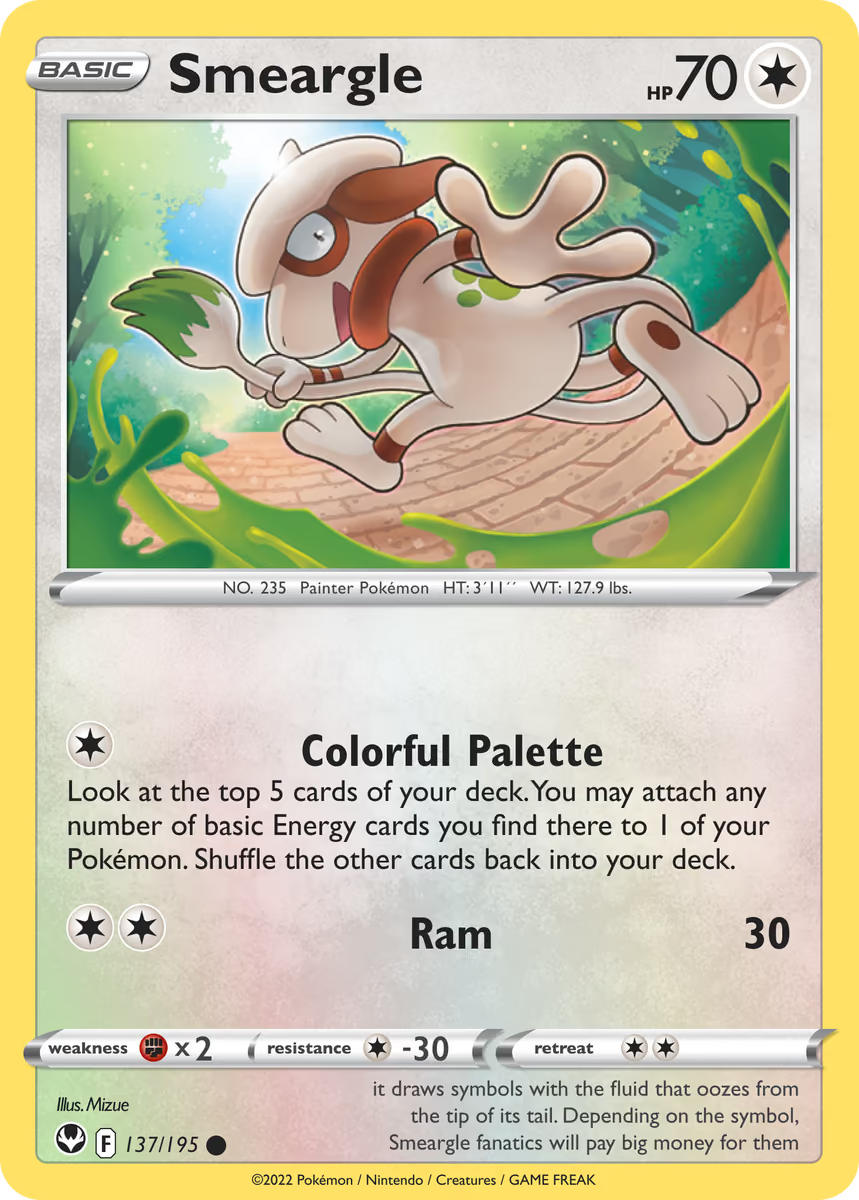
"use client";

import { HoloCard, HoloCardImage } from "@/components/ui/holo-card";

export function HoloCardCosmosDemo() {
  return (
    <HoloCard className="max-w-xs" preset="cosmos" variant="image">
      <HoloCardImage
        alt="Holographic card"
        src="/examples/holo-card/holo-card-light-2.avif"
      />
    </HoloCard>
  );
}
Bursts preset, dark artwork
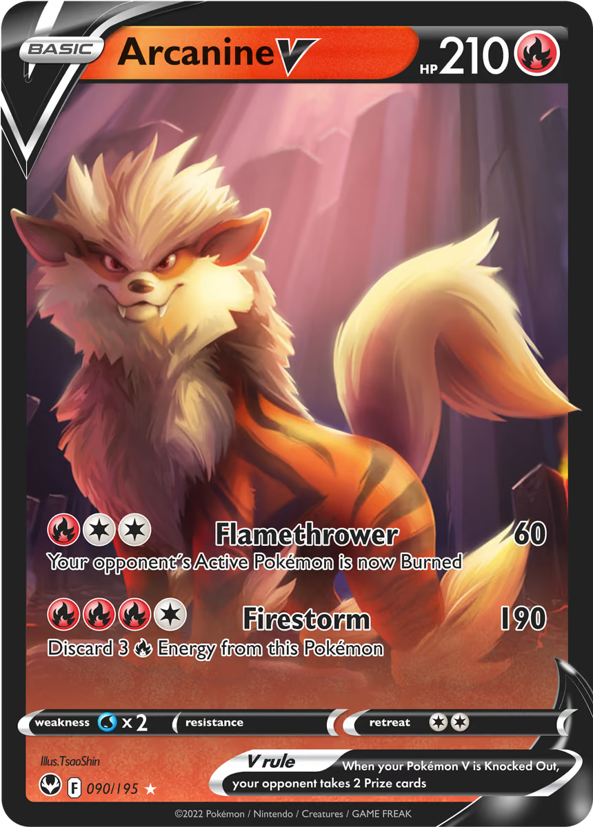
"use client";

import { HoloCard, HoloCardImage } from "@/components/ui/holo-card";

export function HoloCardBurstsDemo() {
  return (
    <HoloCard className="max-w-xs" preset="bursts" variant="image">
      <HoloCardImage
        alt="Holographic card"
        src="/examples/holo-card/holo-card-dark-2.avif"
      />
    </HoloCard>
  );
}
Presets
| Preset | Foil shape |
|---|---|
bursts | Radial bursts from the pointer position. Default. |
cosmos | Layered rings and fine dust. |
API Reference
HoloCard
| Prop | Type | Default | Description |
|---|---|---|---|
variant | cardimage | — | Card layout. `image` requires a HoloCardImage child or the `image` prop. |
logo | stringReactNode | — | Bottom-right mark. Strings starting with /, https://, or data: render as an img. Other strings render as text. Any ReactNode renders as-is. |
chip | ReactNode | — | Override the built-in chip. Pass any element: lucide icon, custom SVG, or img. |
preset | burstscosmos | — | Foil shape. |
image | string | — | Artwork URL. Alternative to the HoloCardImage child. |
alt | string | — | Accessible description of the artwork. |
intensity | number | — | Foil opacity, 0 to 1. |
tiltMax | number | — | Maximum rotation in degrees at the edge. |
glare | number | — | Specular highlight strength, 0 to 1. |
edgeSparkle | number | — | Sparkle density at the card border. |
frame | number | — | Border frame thickness in pixels. |
radius | number | — | Corner radius in pixels. |
width | number | — | Card width in pixels. |
shadow | boolean | — | Render a soft drop shadow. |
idle | boolean | — | Drift the light when the pointer is away. |
backImage | string | — | Back artwork URL. When set, the card becomes flippable. |
children | ReactNode | — | Overlay content rendered above the card. |
foilColor | string | — | Base color of the foil. |
hoverScale | number | — | Scale applied when pointer hovers. |
scale | number | — | Foil pattern scale multiplier. |
className | string | — | Merged into the root. |
style | CSSProperties | — | Merged into the root style object. |
Extends React.ComponentProps<"div">.
HoloCardImage
| Prop | Type | Default | Description |
|---|---|---|---|
src* | string | — | Artwork URL. |
alt* | string | — | Accessible description. |
Marker component. HoloCard reads src and alt from this child and switches to image mode.
Accessibility
- Pass a meaningful
alttoHoloCardImageor thealtprop onHoloCard. - Tilt follows the pointer on desktop and the device orientation on touch devices.
- Motion respects
prefers-reduced-motion- tilt, springs, and orientation are disabled. - The card is focusable only when a
backImageis provided for flip interaction.
Best Practices
- Use artwork that reads at a glance. In image mode the foil adds motion; the image carries identity.
- Provide a
logofor card mode. Without one, only the chip is visible in the bottom-right region. - Keep
intensitybetween 0.6 and 0.9. High values overwhelm text layered on top. - Pick
burstsfor bright palettes,cosmosfor dark palettes. Bursts read best on colorful art; cosmos reads best on deep backgrounds.